Placer.ai | 2025
Beyond Compliance: Rebuilding a Platform for Accessibility and Scale
SUMMARY
In a high-velocity environment, the Placer Design System is a critical asset for maintaining visual consistency and speed. I co-led the initiative to integrate accessibility as a foundational layer of the system, transforming a compliance requirement into a catalyst for platform-wide Design System adoption.
THE OUTCOME
Preserved high-value customer contracts through a core accessibility overhaul. Beyond compliance, the project delivered a more cohesive UI and a reusable component library, accelerating release cycles and ensuring UX consistency across the platform.
BUSINESS MODAL
B2B SaaS / PLG
DEVICE
Desktop
COLLABORATORS
Senior Product Designer (me), Lead Product Designer, 1 Engineer, Director of Product Design, Brand Design
Core Principles of Accessibility
Perceivable
Text size, scaling, good contrast, text alternatives for non-text content, don’t convey info with color only.
Operable
Make all functionality available from a keyboard or a keyboard interface.
Understandable
Labels and instructions are provided to users whenever content requires input, e.g. sign up or login forms.
Robust
Can be interpreted reliably by a wide variety of user agents, including assistive technologies.
Bridging the Gap:
From Legal Requirement to UX Standard
With approximately 40% of Placer customers operating in the civic sector, adhering to ADA and WCAG 2.1 AA standards is a business-critical requirement. However, we viewed accessibility as more than just a legal mandate; it was the ideal catalyst to drive a platform-wide modernization through our design system.
Since significant portions of the platform still relied on legacy UI, we leveraged the accessibility initiative to accelerate the migration to our current Design System. By auditing the product for accessibility failures, we identified and implemented universal fixes that not only resolved compliance gaps but also unified the user experience.
A strategic cornerstone of this transition was standardizing all data tables using AG Grid. By adopting a library with robust, built-in accessibility features, we established a baseline of compliance for our most data-heavy pages while simultaneously enhancing usability through advanced sorting and filtering.
Successfully scaling these accessibility standards across the entire platform required deep, cross-functional collaboration between Design, Engineering, and QA to ensure every component met our new, elevated standard.

Outdated UI, not accessible

Design System component, AG grid implementation


From Complexity to Clarity:
Redefining Placer’s Iconography
As part of our WCAG initiative, I led the transition from a custom, overly detailed icon set to the Phosphor Icons library. The legacy icons were difficult to maintain and often failed legibility tests at smaller scales. The iconography overhaul included:
Audit & Mapping: I conducted a full audit of the platform’s icons, mapping each legacy SVG to a clean, Phosphor equivalent. To ensure a seamless developer handoff, I created a mapping sheet that allowed for an automated replacement process. Where a suitable replacement wasn't found, I created custom icons.
Accessibility First: We increased the default icon size from 18px to 24px and rigorously tested all components to ensure the larger footprint didn't cause breaking changes in the layout.

Old vs new menu example

Mapping old vs new icons and names
The "Icon Container" Component
To unify our visual voice, we consolidated "illustrative" and "metric" icons into a single standardized component. This allowed designers to pull any icon from the Phosphor gallery into a container with pre-defined, accessible styles and sizes, ensuring consistency across the entire platform.


Strategic UI Patterns:
Standardizing Dialogs

Snippet of the dialog box audit

State-based iconography, with exceptions for frequently used icons

New confirmation dialog component build

Reusable modal presets with standardized copy
A Unified Source of Truth:
Documentation & Consistency
We leveraged Storybook as our living documentation hub, ensuring every component underwent rigorous visual QA and WCAG compliance testing through an integrated accessibility checker. To bridge the gap between this codebase and our design process, I focused on creating an actionable, platform-wide documentation strategy:
Figma as the Design Blueprint: I maintained comprehensive Figma guidelines, including legacy-to-new icon mappings and component usage rules. This ensured designers had clear guardrails and that no context was lost during the platform-wide transition.
Audit-Driven Scalability: I conducted extensive UX and UI audits to identify inconsistencies across the platform. By mapping out all existing use cases and interaction scenarios, I ensured that our new design patterns were flexible enough to handle complex, real-world edge cases.
Precision in Implementation: For developers, I provided detailed Jira specifications and documented accessibility requirements. This precision reduced handoff friction and ensured that "accessible by design" translated perfectly into "accessible in production."
By aligning our design documentation in Figma with our technical implementation in Storybook, we transformed the Design System into a reliable, single source of truth that accelerated release cycles and unified the user experience.


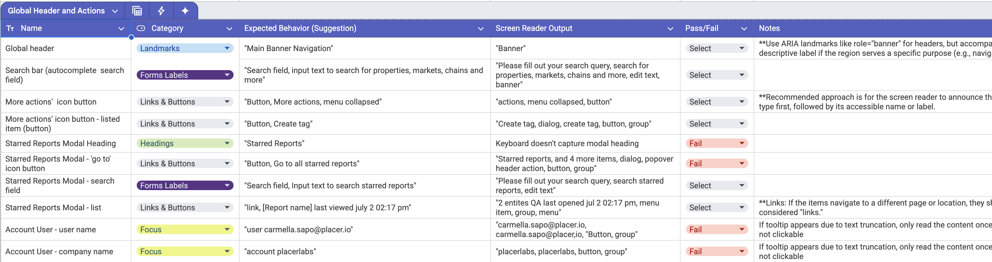
AI-Augmented QA:
Scaling Accessibility Audits
Recognizing that manual screen reader QA would have delayed our release by weeks, I leveraged Gemini to architect an automated auditing workflow. By developing a high-fidelity prompt framework, we were able to map complex data categories directly to WCAG criteria.
Precision at Scale: The system analyzed components to output precise expected behaviors and 'pass/fail' statuses, ensuring every edge case was accounted for.
Team Empowerment: Sharing this logic with the broader design and engineering teams transformed our QA process from a manual bottleneck into a scalable, consistent operation.
The Result: We achieved a level of testing rigor that would have been impossible through manual efforts alone, significantly accelerating our timeline without compromising on compliance.
The Results:
Scaling Impact through Accessibility
Transforming our design system into a fully WCAG-compliant framework did more than just satisfy legal mandates; it modernized the foundation of the Placer platform. By auditing and refining every component for color contrast, keyboard navigation, and screen-reader compatibility, we achieved a dual victory: a more inclusive product and a more efficient workflow.
Key Outcomes:
Secured Market Growth: By meeting ADA and WCAG 2.1 AA standards, we preserved and strengthened relationships with our civic sector customers, who represent 40% of Placer’s client base.
Systemic Efficiency: Standardizing on an accessible, reusable component library accelerated UI updates, significantly reducing turnaround time for both design and development teams.
Design-Led Innovation: Leveraging AI-augmented QA transformed a multi-week manual bottleneck into a scalable, automated process, ensuring 100% testing consistency across the platform.
Operational Excellence: Established a unified source of truth across Figma, Jira, and Storybook, eliminating handoff friction and ensuring that "accessible by design" is always "accessible in production."
Through this initiative, accessibility was elevated from a checkbox requirement to a core design principle, resulting in a cleaner, more maintainable, and truly inclusive system.