Placer.ai | 2023 - 2024
A Strategic Migration and UX Optimization of Placer XTRA
SUMMARY
I led the end-to-end design strategy to integrate Placer XTRA into the Marketplace, replacing a fragmented user experience. My mission was to re-architect an intricate form-logic that had become a major operational bottleneck, requiring heavy manual intervention from support teams to complete.
THE OUTCOME
I transformed a support-heavy service into a streamlined, self-service catalog, significantly reducing operational overhead. This shift accelerated user time-to-value and established a scalable framework for future product expansions with zero additional design effort.
BUSINESS MODAL
B2B SaaS / PLG
DEVICE
Desktop
COLLABORATORS
Senior Product Designer (me), Product Manager, Full-Stack Engineer, Brand Design, Marketing, Support Engineering
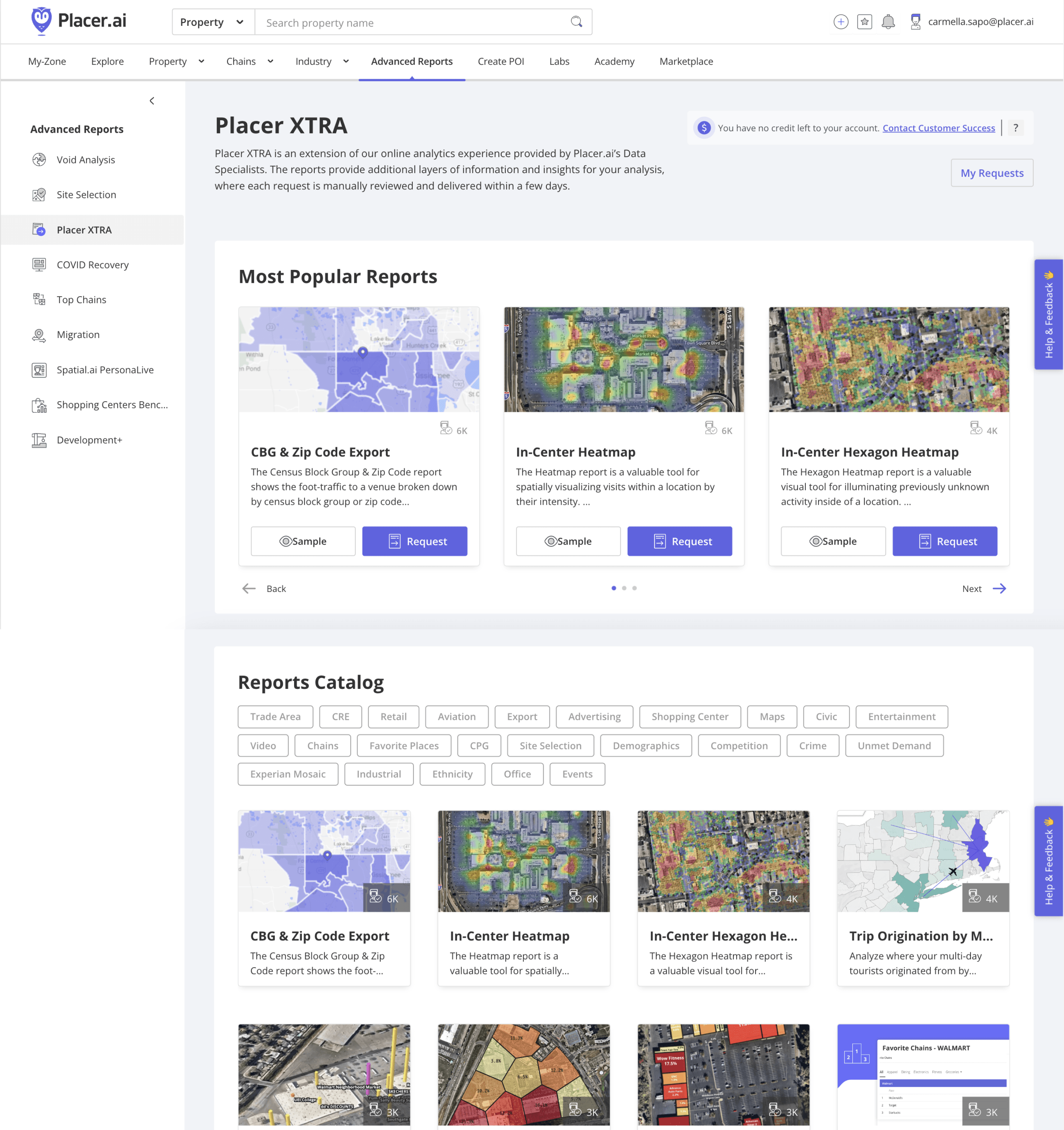
Previous XTRA catalog
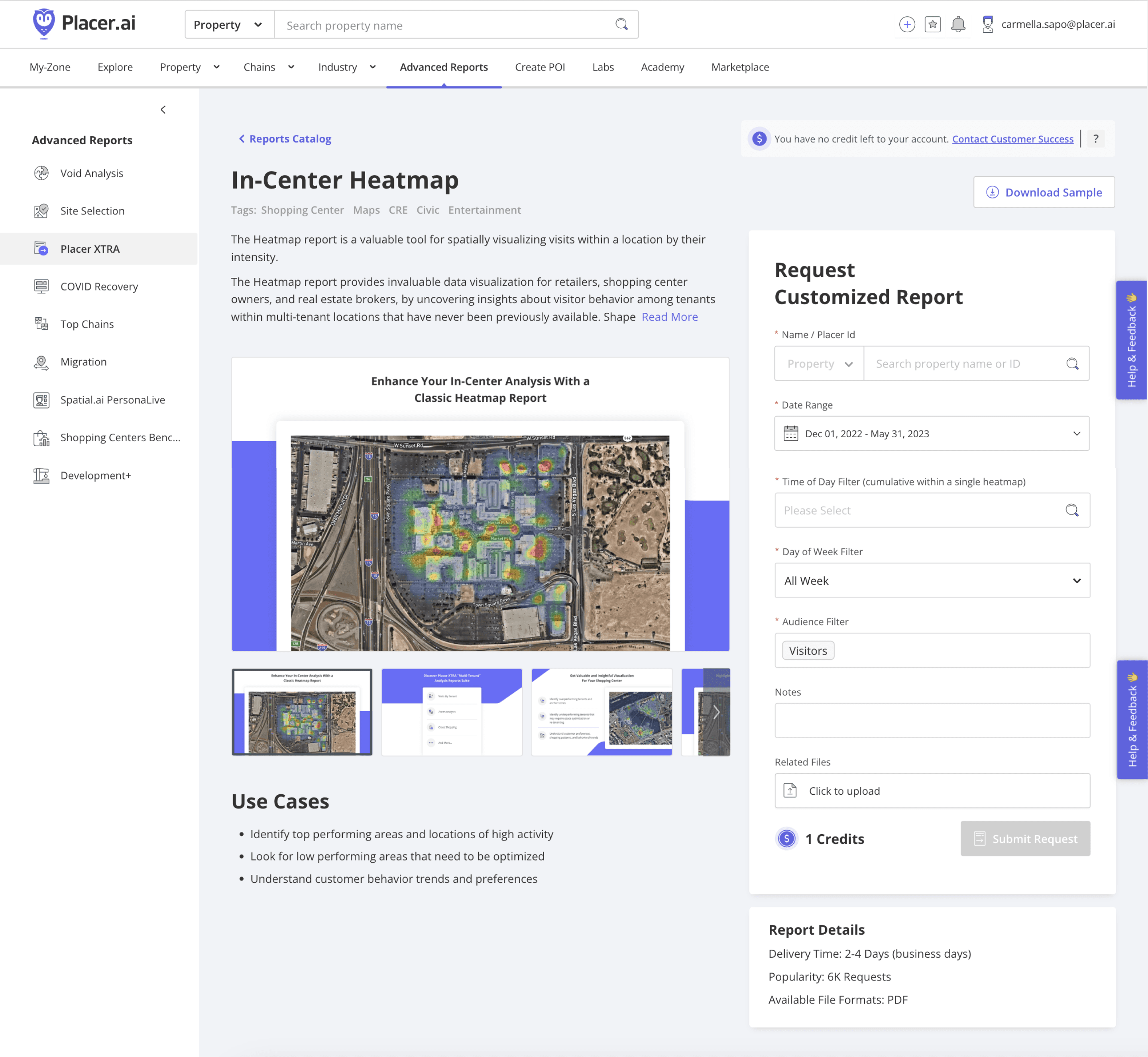
Previous XTRA listing page
The New Placer XTRA experience
Context & Business Problem
Placer XTRA is a catalog of customizable reports and data exports available for premium Placer.ai users via a credit-based system. Previously, it operated as a standalone add-on, located separately from the Marketplace. This created a disjointed experience and missed key opportunities for discovery.
Our first milestone (MS1) focused on speed-to-market for a unified platform. Having successfully achieved that goal, we advanced to MS1.1 with a focus on architecting visual solutions to reduce operational overhead and increase user adoption.
Strategic Discovery:
Identifying High-Impact Wins (MS1.1)
To identify where we could enhance the UX, I conducted research sessions with experienced Customer Success Managers (CSMs) and validated their feedback by auditing call recordings in Gong.
Each XTRA report required users to fill out a high-precision form with the required data our teams needed in order to generate the report. These forms were incredibly complex and lacked good UX. My goal was to transform these technical forms into intuitive, self-service tools.
My user research had revealed that the sheer complexity and length of the forms acted as a major deterrent for users. This friction forced our Customer Success team to manually intervene and submit reports on behalf of users, creating a significant operational bottleneck. Furthermore, the high-precision requirements meant that any errors caused by this cumbersome process delayed On-Time Delivery (OTD), compromising user trust and our reputation for reliability.
I categorized my research findings into a two-tiered roadmap:
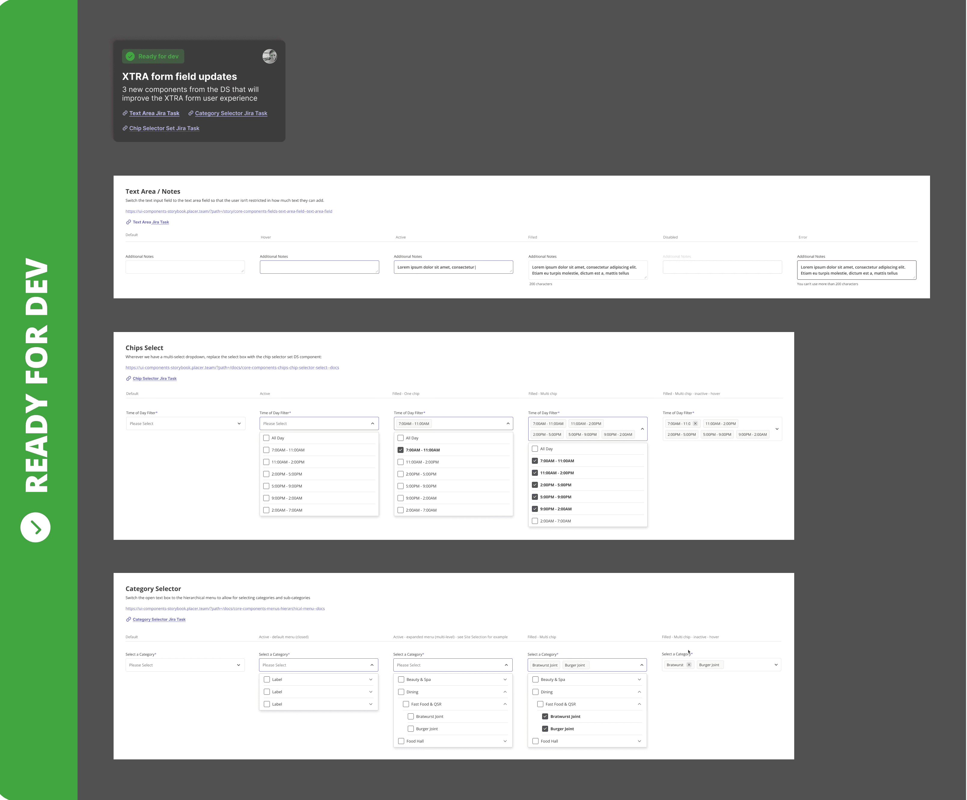
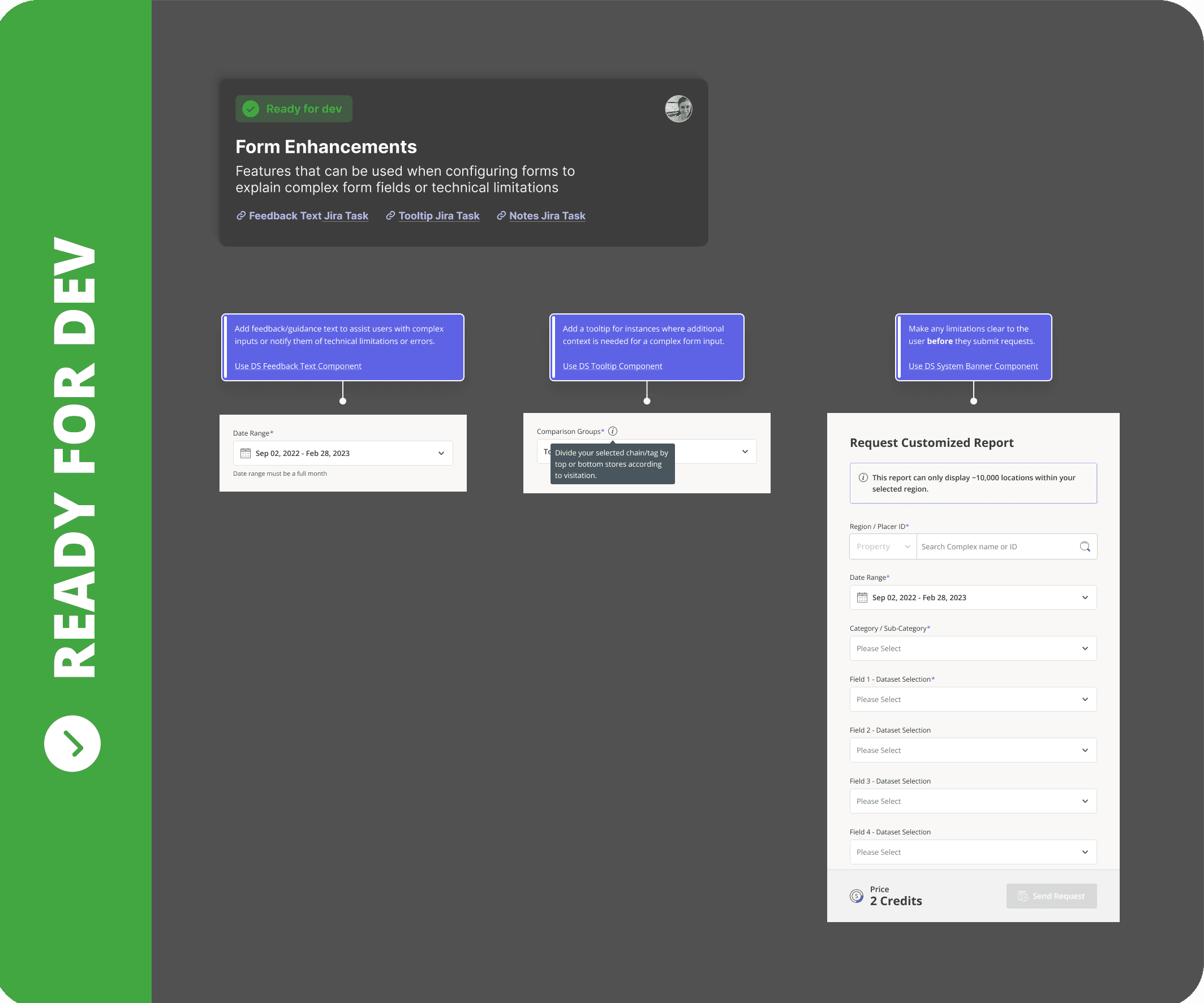
Design System Quick-Wins: I implemented immediate enhancements using existing components, such as tooltips and banners to guide users through difficult fields. These solutions were already approved and developed in the Placer.ai design system - meaning they would be quick for development to implement.
Complex Feature Requests: I mapped out custom solutions for high-impact feature requests - such as the Multi-POI and Dataset Selection - prioritizing them based on report popularity and development effort.
The Dual-Environment Constraint
& Data-Driven Advocacy
A primary challenge was the dual-environment constraint: the catalog had to function within both the Marketplace and the core Placer.ai dashboard. Since these environments had different UI patterns, maintaining two separate experiences risked long-term design debt and a fragmented journey.
To address this, I used FullStory to analyze user navigation and advocate for a unified UI. I presented my findings to the VP of Product to challenge the dual-design constraint. The discussion revealed a confidential, long-term platform vision that necessitated temporary fragmentation. While we ultimately proceeded with two iterations to balance dashboard consistency with Marketplace branding, this exercise ensured our execution was strategically aligned with the company’s future roadmap.
XTRA experience inside the dashboard

XTRA experience inside the Marketplace
Building a Self-Service Framework
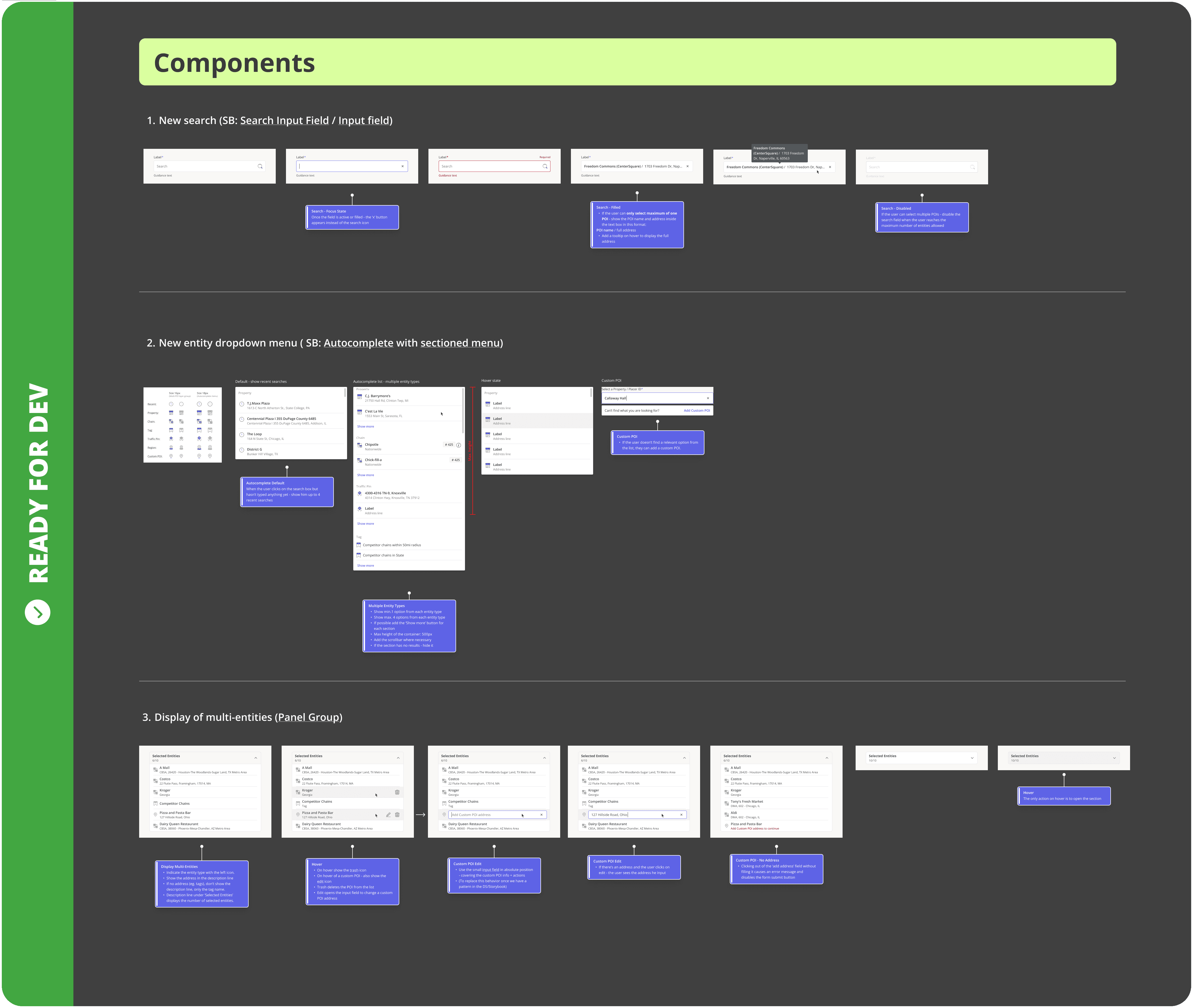
To address 2 major blockers identified in research, I designed two modular form components to replace manual, error-prone workflows with intuitive, system-verified tools.
Multi-POI:
Eliminating the CSV Bottleneck
The original request process was fragmented; users were restricted to selecting a single location manually, forcing any additional Points of Interest (POIs) into a cumbersome CSV upload. This external dependency led to frequent formatting errors and significant delays in report generation.
I began with a thorough internal audit of existing UI patterns to ensure brand and functional consistency. By presenting low-fidelity explorations to stakeholders early, I identified technical constraints that allowed me to pivot quickly, focusing on viable, high-impact directions before moving into high-fidelity design.
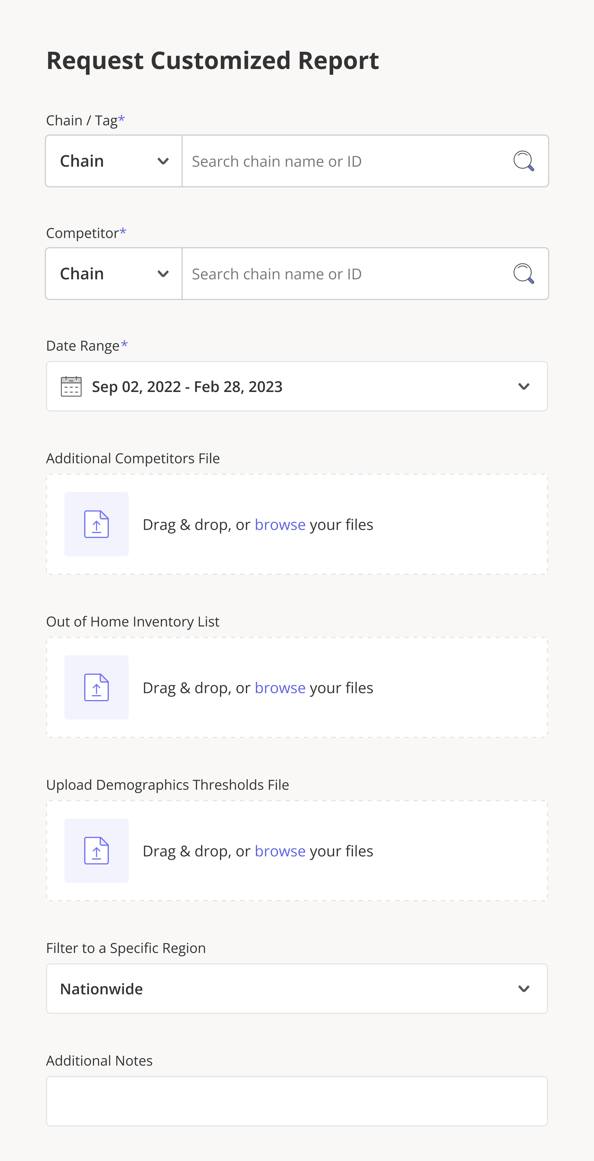
The original user experience
Lo-Fi Solutions Exploration
During the handoff, engineering initially pushed back due to tight deadlines. To bridge the gap, I collaborated closely with our developers and the Design System team to identify existing components that could be repurposed for our needs. This cross-functional partnership allowed us to build a robust development plan that drastically reduced engineering overhead while maintaining design integrity.

My compact solution
Trade-off: In scope solution using exiting DS components
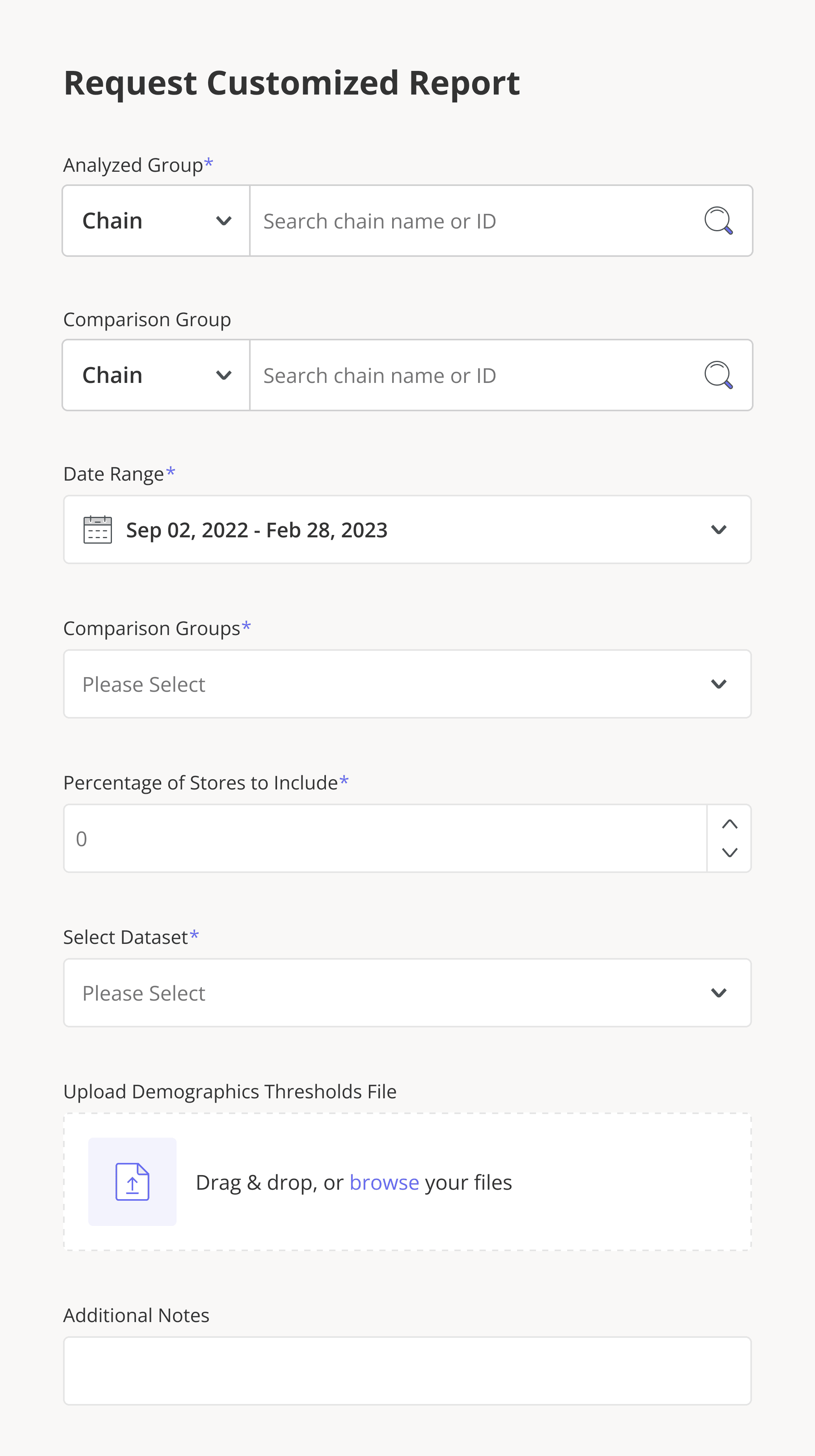
The final interface enables users to search and add multiple locations directly from Placer’s verified database. By internalizing the entire selection process, I eliminated the need for external file management and ensured system-wide data alignment. This transformation accelerated submission times and guaranteed 100% data accuracy, resulting in faster report deliveries and a decline in support tickets related to "missing information."
The new user experience
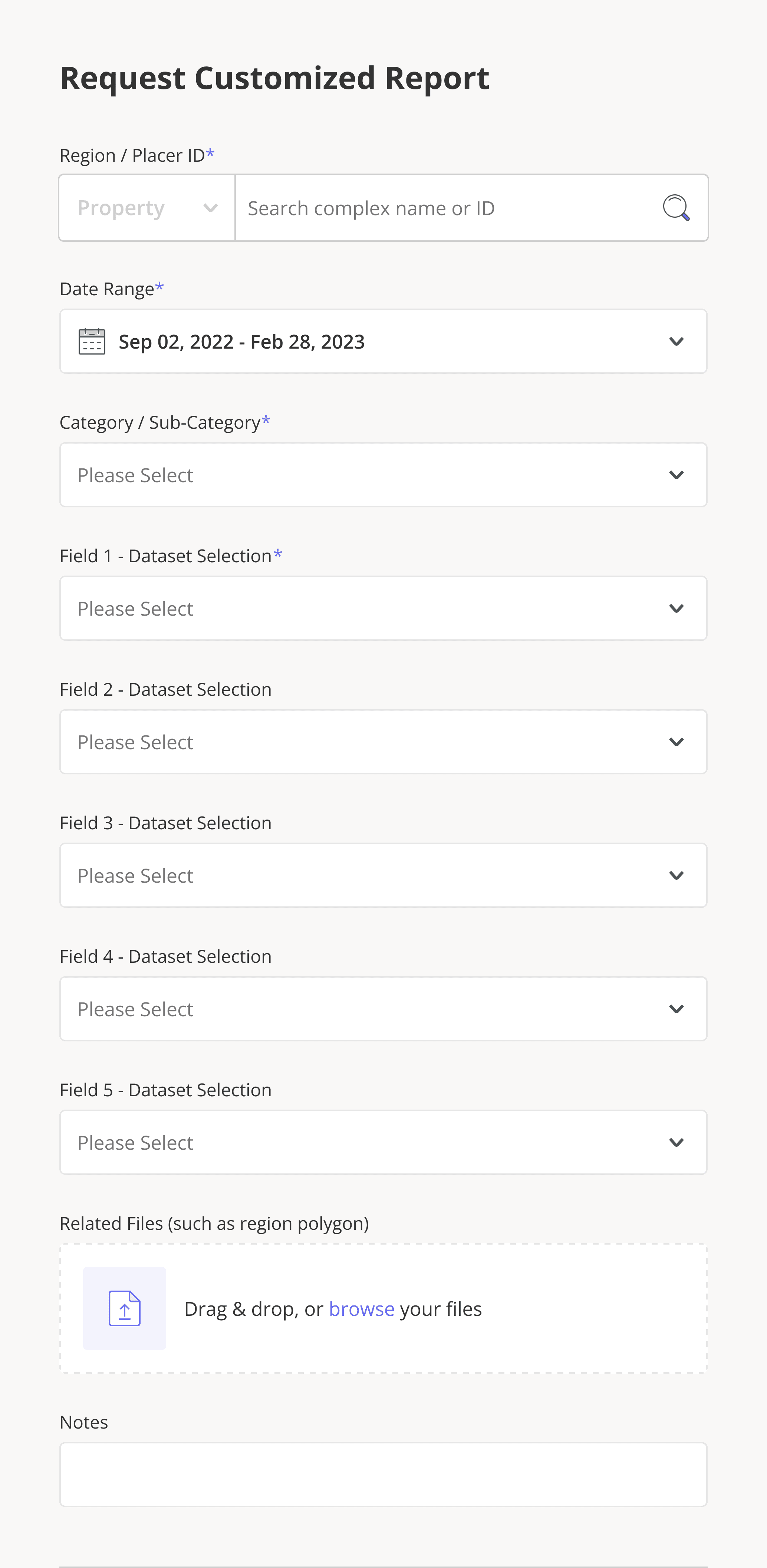
Dataset Selection:
Transforming Manual Entry into Discovery
Previously, adding a dataset to a report was a grueling manual process. Users had to copy-paste names from an external spreadsheet into five separate form fields. This workflow was also "blind" - users had no visibility into which datasets they already owned versus premium options that could enhance their report.

The original user experience
Lo-Fi Solutions Exploration
Through stakeholder interviews, I uncovered an opportunity to move beyond a simple fix and completely overhaul the data structure. We decided to "go all the way," allowing users to navigate through complex dataset "buckets" and "bins." I replaced the manual entry system with a hierarchical tree component, enabling users to browse and select datasets directly within the form. By connecting the interface to our backend, the system now automatically identifies a user's existing permissions in real-time.
We leveraged this backend connectivity to introduce contextual suggestions, surfacing relevant, un-purchased datasets at the exact moment a user is building their report. I consolidated these selections into interactive "chips," providing a clear visual summary of their data package. This transformed a frustrating administrative task into a smooth, high-value discovery experience that directly fuels expansion revenue.
The new user experience
Final Impact & Handoff
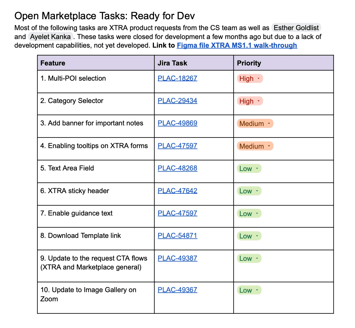
The new design eradicated the need for CSV uploads and guaranteed our support team received correct information, leading to faster delivery times. I led this project up until my maternity leave, documenting every solution in Figma with links to exact Design System components and detailed Jira tasks to ensure a smooth handoff.
While I moved to a new team upon my return and didn't see the post-launch metrics, I would have used the following to measure success:
Adoption Rate: Report Generation Rate (RGR).
Conversion: Report Request Completion Rate
Operational Efficiency: Reduction in report-related support tickets.
User Efficiency: Time to Task Completion (TTC) for the new multi-POI flow.
Key Learnings & Reflections
1. Leverage the "Ecosystem Wins"
I learned the immense value of designing for scale. By migrating XTRA into the Marketplace’s CMS-driven architecture, we didn't just fix a UI; we "unlocked" features for free (like search and filtering). This taught me to always look for architectural solutions that solve multiple problems at once rather than building isolated patches.
2. Documentation is a Product in Itself
Managing a project right up until a long-term leave (maternity) reinforced that handoff documentation is as important as the design itself. Seeing a new developer successfully ship my designs in my absence proved that clear logic, component-linking, and edge-case mapping are the best ways to ensure design intent survives the build phase.
3. Advocacy Through Data Triangulation
Using Gong to validate CSM feedback was a turning point. It’s one thing to hear about a user's pain second-hand; it’s another to show a stakeholder a recording of the struggle. I’ve carried this "triangulation" approach - combining internal stakeholder expertise with raw user data - into every project since.
4. Constraints Breed Efficiency
The "engineering pushback" on the multi-POI feature was a blessing in disguise. It forced me to move away from "custom-built" thinking and toward "Design System composition." Collaborating with the Design System team allowed us to ship a high-value feature in half the time, proving that seniority is often about finding the shortest path to the highest value.
5. Validation
If time permitted, I would have A/B tested the report page architecture - comparing a 'form-forward' layout against 'progressive disclosure' - to see which minimized abandonment rates for users.