Gettacar | 2019 - 2022
Transforming Complexity into Convenience
SUMMARY
Gettacar aimed to move the entire second-hand car-buying journey online. As the initial designer owning end-to-end design, I defined the UX foundations and built the Design System required to scale with the growing team. I focused on building trust during high-friction moments - like loan applications and document uploads - using friction analysis to drive measurable growth.
THE OUTCOME
+20%
loan conversion
-40%
churn reduction
$80M
in annual sales
BUSINESS MODAL
B2C / PLG
DEVICE
Desktop, Tablet, Mobile
COLLABORATORS
Senior Product Designer (me), Co-Sr.Product Designer, Various Product Managers, 4 Front-End Engineers
Target Persona
Low-Mid Income Earners
Seeking affordable cars and flexible financing
Millenials and Older Gen-Z
Digital-first buyers who regularly purchase online
Urban Professionals
Living in major Northeast metropolitan areas
Busy Lifestyle
Leaving little time for lengthy dealership visits
Defining The Visual Aesthetic
When gettacar first launched, its look and feel felt generic and bland. The CEO envisioned something different: a fun, approachable experience that managed to carry the personal touch of a traditional car dealership.
Together, we explored how to bring that vision to life without compromising on clear UX. In one of our early brainstorming sessions, we landed on the idea of creating a mascot - the “Carmoji” - inspired by the gettacar logo. This friendly character would accompany users throughout their journey, making the process of buying a car online feel more human and engaging.
Building on that concept, my co-designer and I led a full rebrand of the platform. We developed custom illustrations, marketing pages, designed complex user flows, and crafted visuals for every touchpoint - from product to social media, transforming gettacar into a brand that was both fun and functional.


Designing a Checkout
That Builds Trust
Designing Gettacar’s checkout flow was all about balance - speed, simplicity, and reassurance. From the start, our goal was to make the process as fast and frictionless as possible, especially since buying a car online can feel daunting. The flow automatically adapted based on the user’s needs: if financing wasn’t required, it became noticeably shorter. We used autocomplete wherever possible and built in conditional logic so users only saw the fields relevant to them.
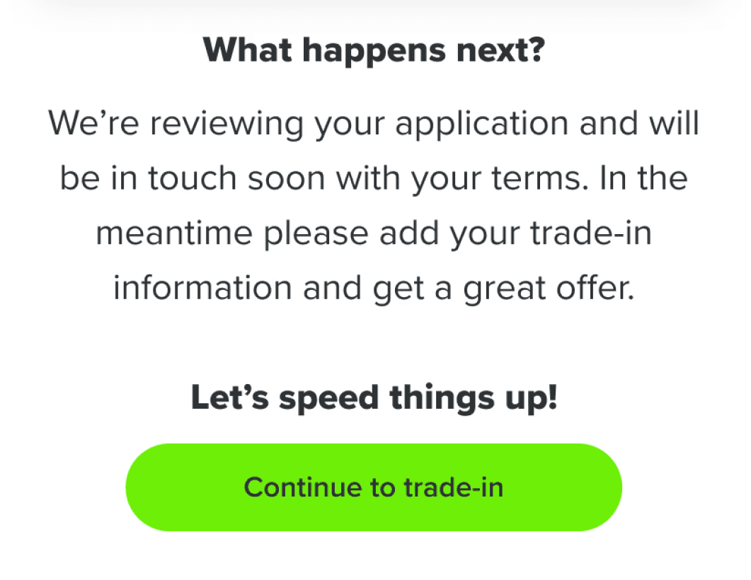
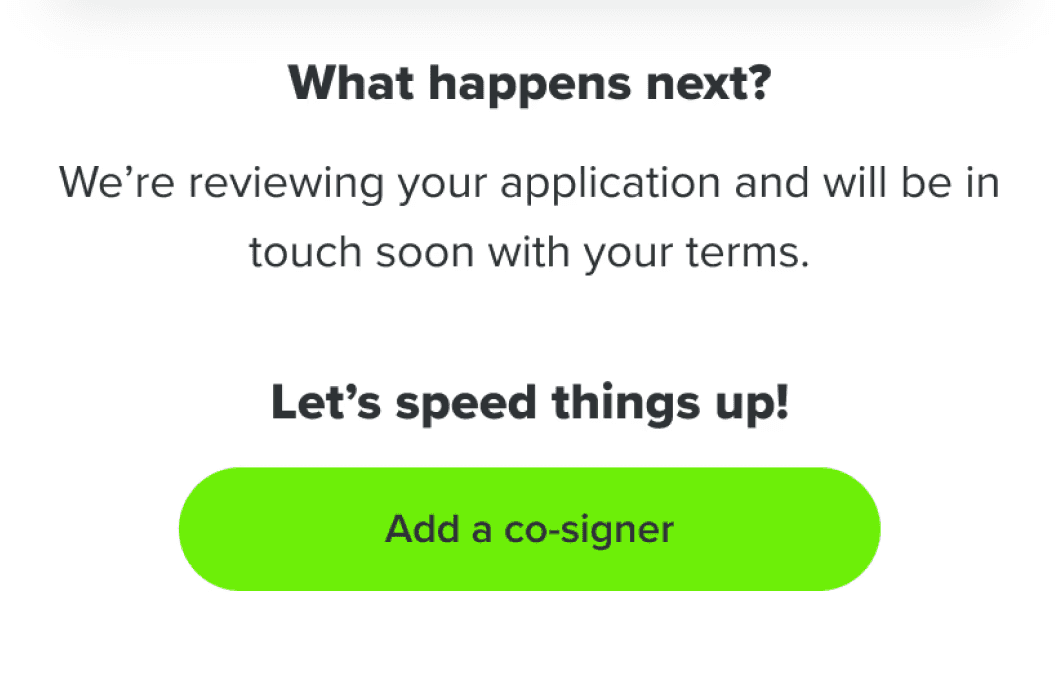
Steps like adding a trade-in or co-signer were simplified into quick, one-click actions which kept checkout fast and frustration-free. At the end of the the checkout, their journey then continued seamlessly with personalized next steps based on each user’s choices.
We continuously tested and refined the experience through A/B testing using FullStory and Google Analytics - adjusting copy, layout, and step order to identify what drove the highest completion rates.
To bring warmth and familiarity to what could otherwise feel transactional, we used conversational language and addressed users by name - echoing the tone of a car dealer.


Guiding Users Seamlessly to Their Next Step
Every journey with Gettacar was designed to feel continuous - no dead ends, no confusion. At the end of each flow, users were always guided toward the most relevant next step through clear, contextual CTAs.
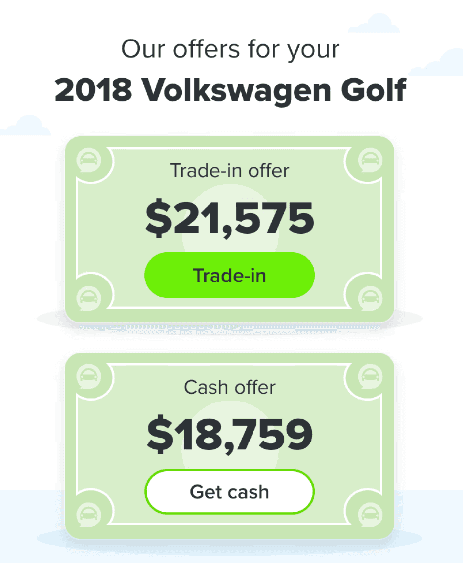
If someone indicated interest in adding a co-signer or trading in a vehicle during checkout, their next screen picked up right where they left off. After completing a trade-in, users could track their order or browse for a car if they hadn’t yet chosen one. Those selling their car were prompted to track their sale or seamlessly switch to a trade-in option. Each transition was intentional - keeping users confident, engaged, and always certain about what came next.


Bringing Order to the Paperwork Chaos
Purchasing a car is filled with excitement until all the paperwork starts. Before the redesign, completing a purchase meant juggling phone calls, texts, and emails between customers and their assigned Customer Success Advisors (CSAs). Documents went missing, messages got crossed, and progress often stalled.
To fix this, we completely overhauled the My Account experience - turning it into a single, transparent hub where customers were in control and could track their order, review financing, upload documents, contact their CSA, and schedule delivery. On mobile or tablet devices - users were able to directly add images using their camera. Each required document or photo was clearly illustrated to help customers understand what exactly we needed from them.
On the other side, CSAs managed everything within the internal Gettahub portal. They could instantly see what was missing, fill in gaps, and help customers complete the process with far less back-and-forth. What was once a fragmented, manual process became a smooth, connected workflow for both sides - cutting delays and reducing friction across the journey.


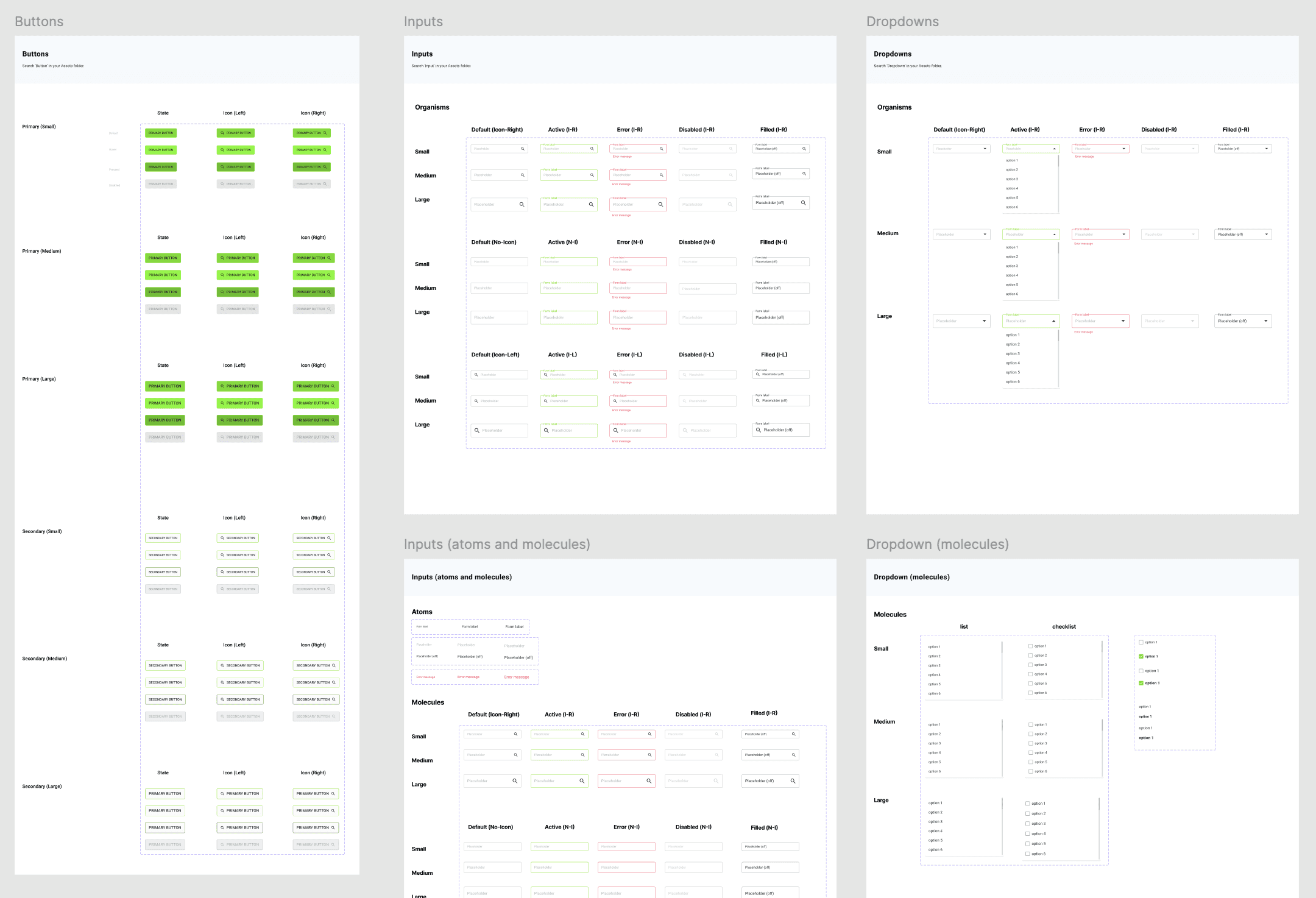
When I first started worked at gettacar there was no design system. Designs were very messy, inconsistent, with no formal grid layouts or a defined color palette. Simple design updates required a lot of tedious manual work. When the design team started to re-design the website, I took the opportunity to create a gettacar design system to improve our efficiency, collaboration, and consistency. This helped us churn out work significantly faster and make quick updates across the designs.
Bringing Designs to Life
Through Cross-Team Collaboration
Once the designs were approved, collaboration kicked into high gear. The product manager and I met with the front-end, back-end, and QA teams to review the PRD and walk through the flows together. Feedback loops were quick and constant - if something didn’t make sense technically or could be improved, we refined it as soon as possible (often immediately after the meeting).
Design handoffs were managed through Zeplin, ensuring developers had everything they needed, from specs to states. Working in two-week sprints meant momentum was key - designs moved from concept to code in a matter of days. Once in staging, I partnered with QA to conduct design reviews across multiple iPhones, iPads, and desktops, making sure every detail felt right before launching to production.
The Results
Gettacar operated successfully with a significant 186% year-over-year sales growth in 2020. The platform scaled to selling over 3,000 vehicles annually and achieved approximately $80 million in sales by 2021. However, this growth was later unsustainable due to intensified market competition and a critical lack of inventory resulting from global pandemic-related manufacturing shutdowns. Ultimately, this combination of factors led to the company's closure in 2023.