Placer.ai | 2022 - 2024
Expanding Placer.ai’s Capabilities via a Unified Marketplace
SUMMARY
The Placer.ai Marketplace offers essential third-party integrations, yet its growth was hindered by poor discoverability and an outdated UI. I led the Marketplace revitalization to transform this fragmented experience into a responsive, high-conversion growth engine, focusing on bridging the gap between complex data offerings and effortless user adoption.
THE OUTCOME
The revitalization drove ~50% ARR growth year-over-year (Q4 2022–Q4 2023) while significantly improving operational efficiency. By implementing a self-serve CMS, I eliminated Marketing’s dependency on Engineering and Design for content updates, allowing for instantaneous marketplace listings and scalable platform growth.
BUSINESS MODAL
DEVICE
Desktop, Tablet, Mobile
COLLABORATORS
Senior Product Designer (me), Product Manager, Full-Stack Engineer, Brand Design, Marketing
Marketplace growth was held
back by several systemic issues
Low Discovery: The Marketplace lived on a separate domain, creating a disjointed experience and preventing contextual upselling.
Manual Bottlenecks: The Marketing team was unable to publish or edit listings without design and engineering intervention.
Friction-Heavy Leads: Unclear forms forced users to contact Support just to express interest in a product.
The Previous Marketplace experience
The Strategy:
Designing for Agility & Constraints
With an accelerated three-month roadmap until our deadline for an MVP, we had to balance high-impact design with technical limitations. Because the team used a restrictive Tailwind component library for the build, I focused on creating a specialized design system that was both on-brand and technically feasible within those constraints.

Refining the Aesthetic:
The Listing & Card Strategy
During the redesign, we made several strategic aesthetic choices:
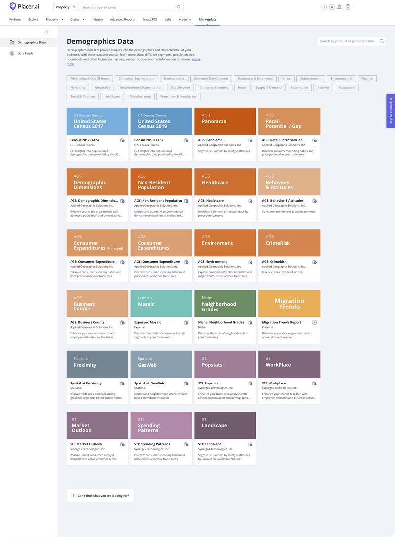
Logo-Centric Cards: We pivoted from the previous card design to a clean, logo-centric approach. This ensured visual consistency across diverse third-party brands and allowed the catalog to look professional and cohesive.
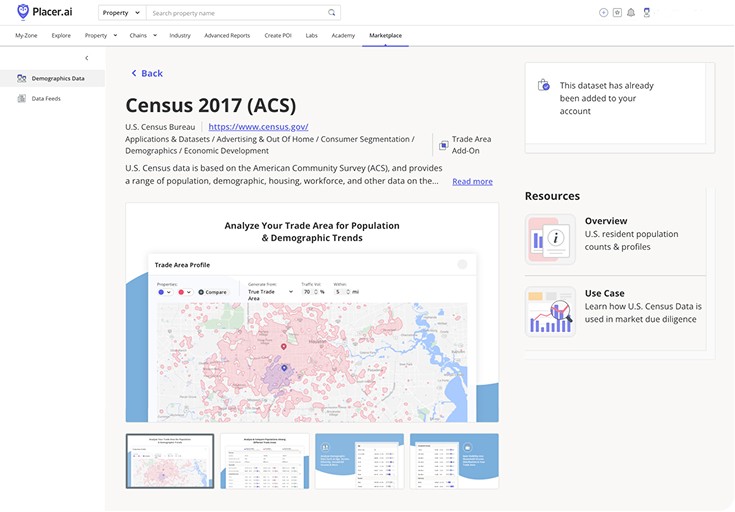
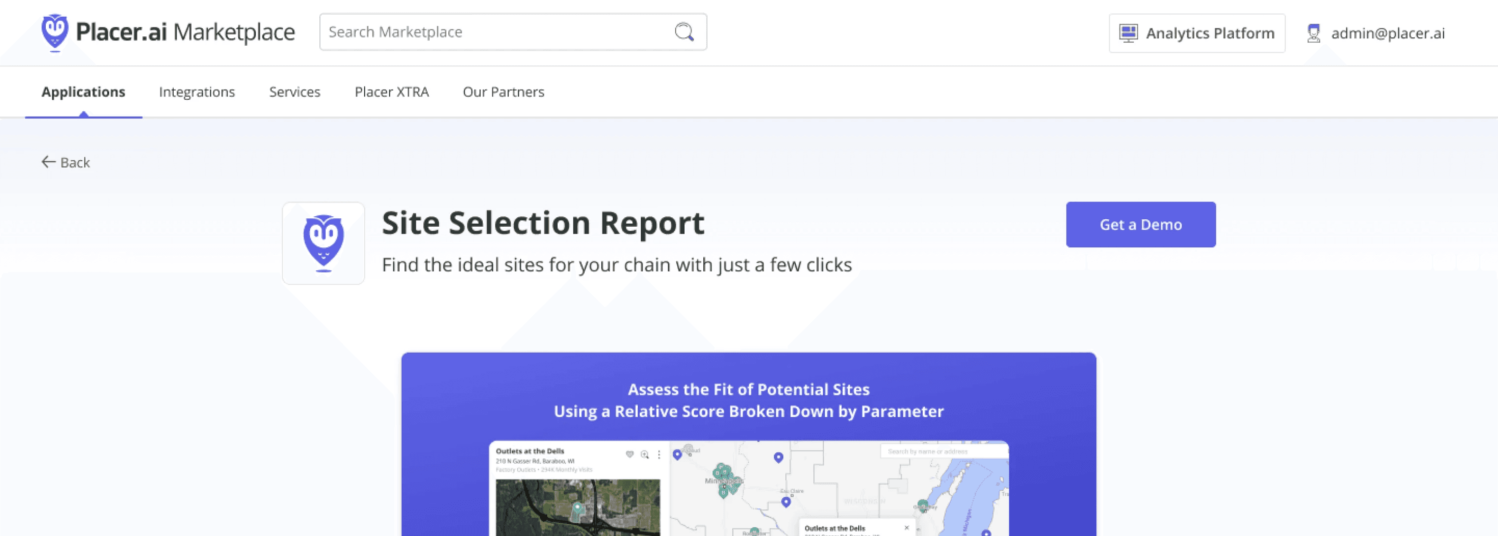
Optimized Listing Layout: I designed the product listing page to be "image-forward" - with the marketing images taking the majority of space on the page above the fold, and ensuring that more detailed content was slightly visible just above the fold. This signaled to the user that more information was available below without sacrificing the premium, visual feel of the brand.
Contextual Discovery:
The Marketplace Drawer
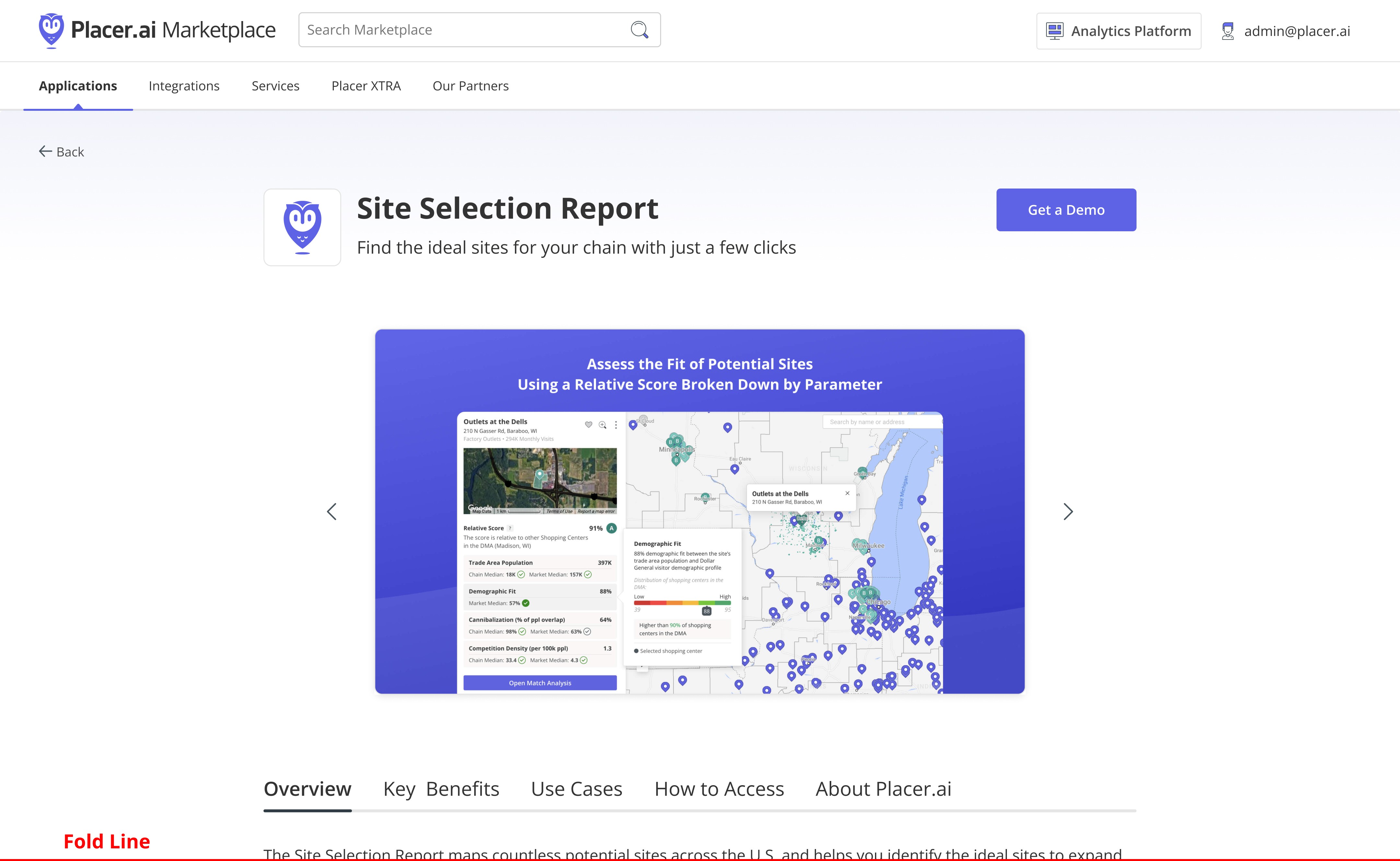
Instead of forcing users to leave their workflow to explore add-ons, we introduced an embedded Marketplace Drawer directly within the Placer.ai dashboard. This allowed us to contextually promote relevant products (like Retail Sales in the example below) at the exact moment a user was viewing foot traffic insights, significantly increasing conversion efficiency.

High-Conversion UX:
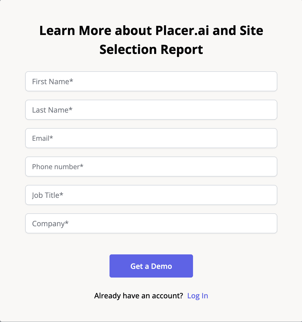
The One-Click Approach
To reduce friction, I implemented a "One-Click" request flow for logged-in users. For prospective customers, I designed a minimal lead-capture form. By removing unnecessary fields, we lowered the barrier to entry and increased the volume of qualified leads for the sales team.


Operational Autonomy via CMS


Different template design for single datasets vs. dataset packs


Some of the design documentation and system I created for Marketing to create consistent visuals without designers


The Results
The revitalization of the Marketplace successfully shifted it from a "hidden" tool to a core revenue driver. While we shipped an initial MVP in just three months, that was only the foundation. Following the launch, I led a deep-dive collaboration with the Content and Branding teams to define a more sophisticated visual language and align with complex content requirements. This iterative process culminated in a comprehensive redesign that fully realized the Marketplace's potential.
ARR Growth:
Contributed to a 50% YoY increase in Marketplace ARR.
Marketing Agility:
Empowered Marketing to publish updates instantly via an integrated CMS, removing the need for design or engineering support.
Seamless Experience:
Transitioning to a fully responsive, embedded drawer improved user retention and discovery across the platform.